(Cross-posted on the Google Docs blog.)
When you’re working with spreadsheets, it’s important to turn your raw data into a story. With today’s updates to Google Sheets on the web, you’ll find even more ways to visualize and analyze your data.
Customized charts, made easier
Charts can make even the largest data sets digestible, so we’ve made a few improvements to help you highlight what’s most important.
Starting today, you can add data labels to display the exact value of bars or points. And when you’re using line or scatter charts, you can change the shapes of your data points. Choose from stars, triangles, pentagons and more.
Today’s update also includes new tools for analyzing your spreadsheet data. For example, you can:
- Preview formula results—instantly—as you type. This feature is especially useful for catching formula errors quickly and is unique to Sheets.
- Filter rows and columns by conditions, including “greater than” and “text contains.” This way you’ll only see the numbers, dates and text you need.
- Add calculated fields to pivot tables when you want to apply formulas to pivot table data.
- Use the GETPIVOTDATA function to more easily retrieve data from your pivot table.
Collaborate, confidently
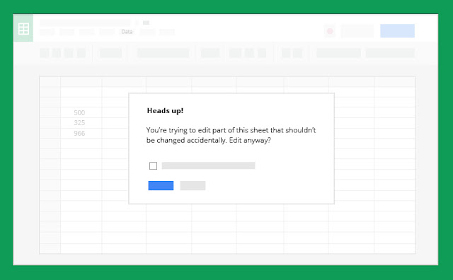
The more the merrier when it comes to collaborating in Sheets, but sometimes you need to take extra steps to preserve your hard work from accidental edits. With Sheets, you’ve been able to restrict editing to a specific set of users and a specific range, but now you can also warn folks who try to edit certain cells. This way you can collaborate with others, and remind everyone (even yourself) to edit with care.
Try these updated Sheets features on the web today and start telling better stories with your data.


